What The Font?
Typeface and Font Politics on America’s Roads
Ami Pascual takes us to the little-known world of fonts on freeway signs and makes us see that there is a lot more to it than “just some text on some green sign”. The mystery and intrigue behind the words and numbers we see on road signs every day is hidden from most of us, but it matches the level of subterfuge in an episode of the Bachelor.
By Ami Pascual & Guest Author: Sydney Mallari
Fri, Mar 19, 2021 08:00 AM PST
One of the few comforts of lockdown life is that we can still hit the freeways in the privacy of our vehicles, mask-less and Covid free. That is, until we get to our destination, if we get to our destination. Ever wonder why some people are late to or give up going to where they need to go, especially at night? One reason might be that they were blinded by the light, figuratively. Or blinded by the Highway Gothic font, literally.
In graphic design and photography, there is a term called “halation” which means a blurred or “halo” effect around the edges of a letter, number or photographic image. When headlights bounce off the reflective material on an exit sign, for example, letters and numbers become a fuzzy glow, creating a blinding effect on motorists. Halation can be aggravating and dangerous, especially for the approximately 30 million licensed drivers over 70 years old in the United States (Federal Highway Administration, 2020). Younger drivers with contrast sensitive eyesight are also at risk of this blinding effect.
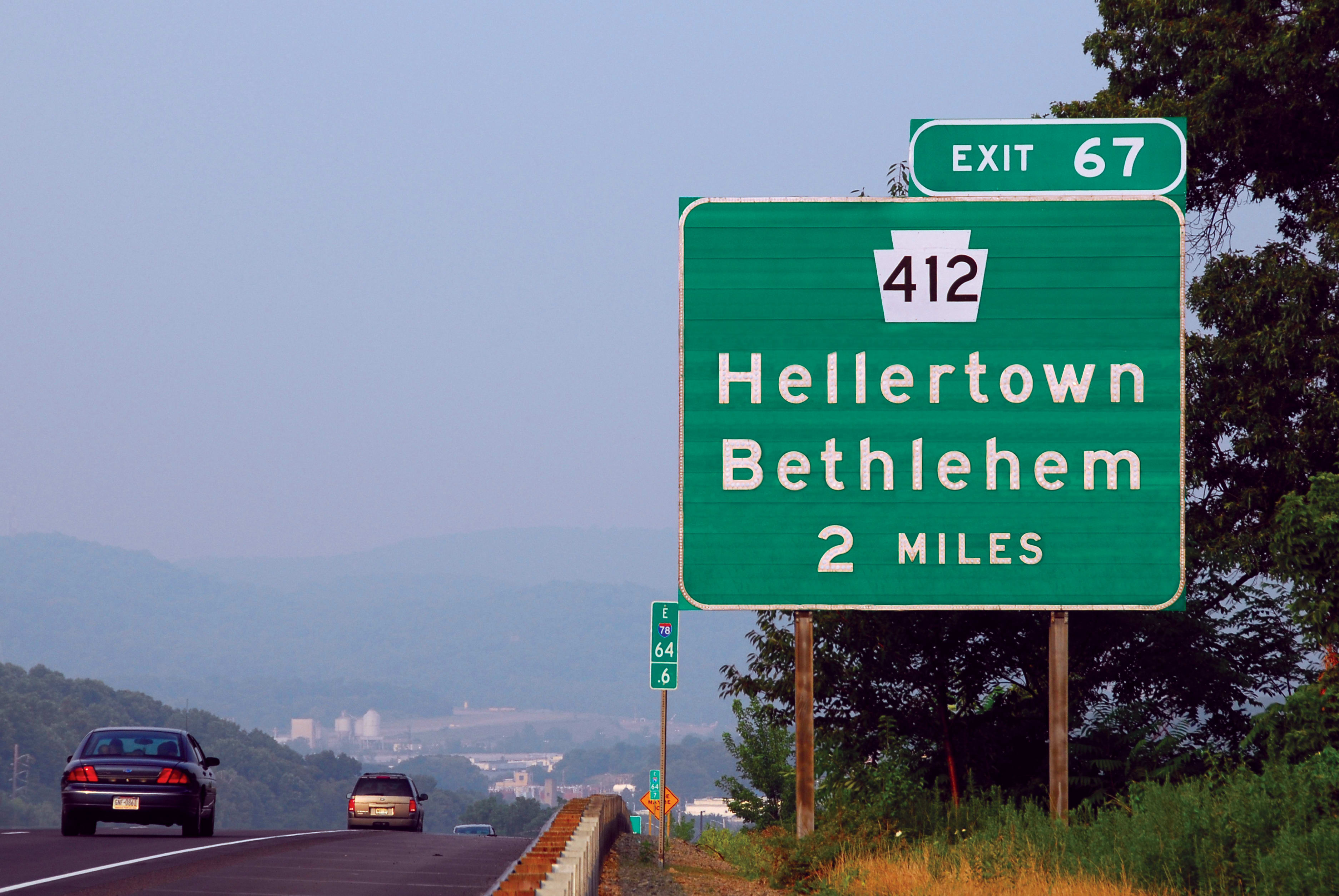
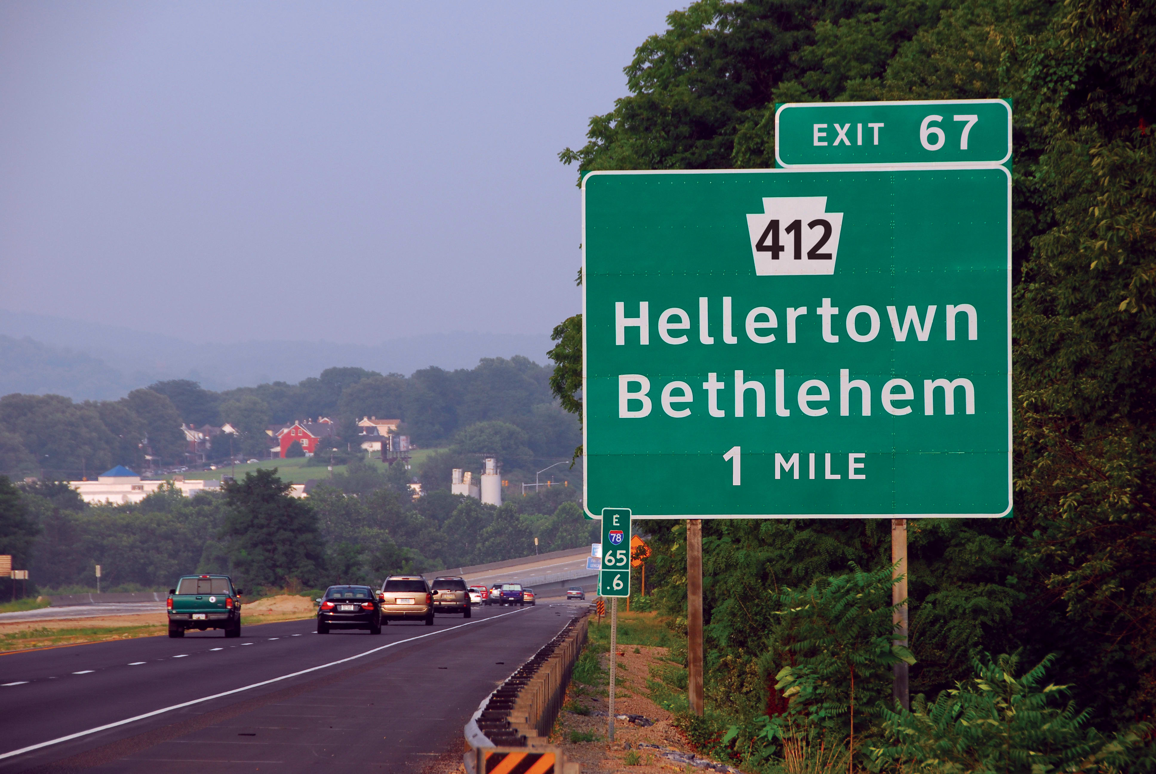
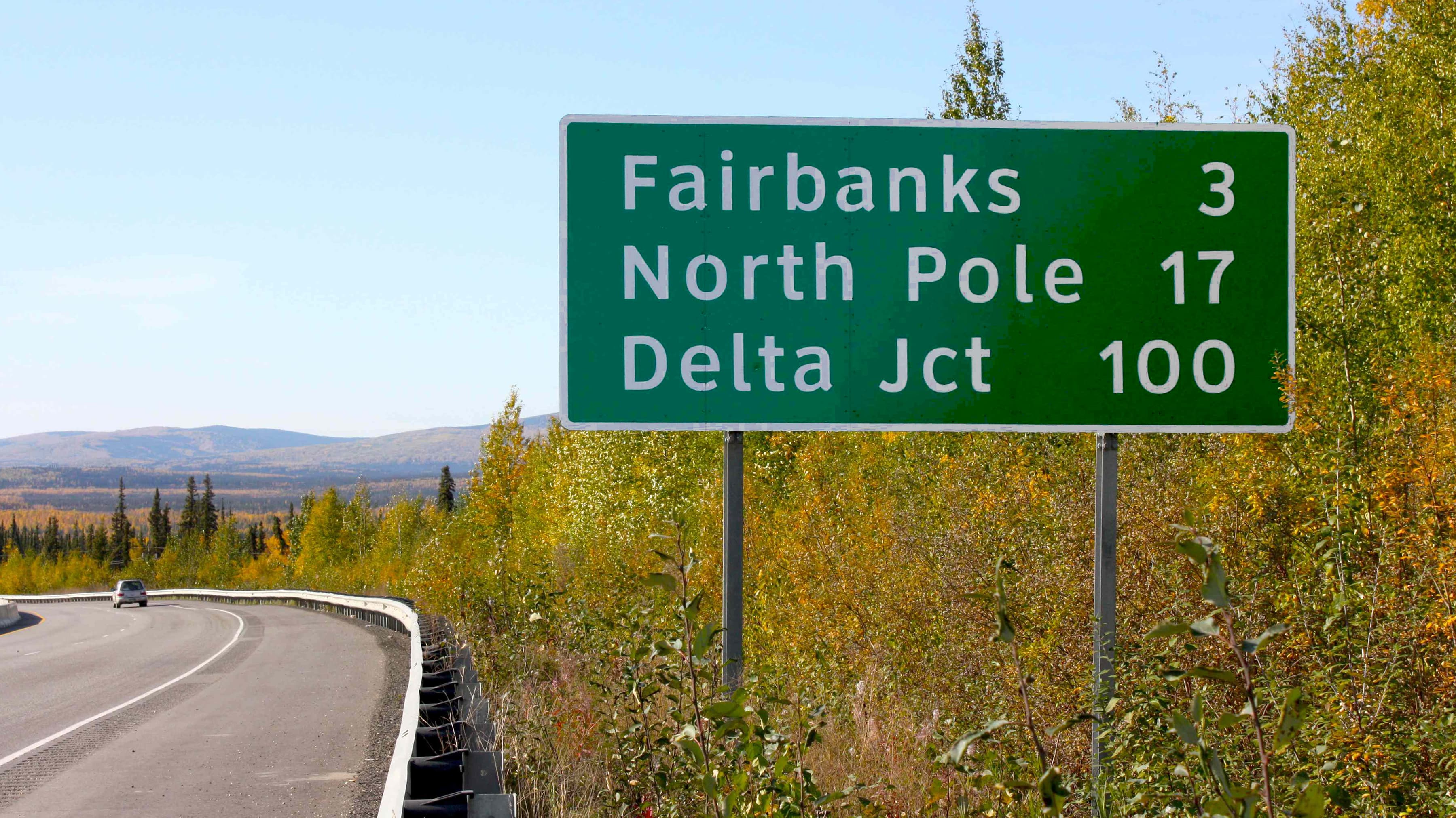
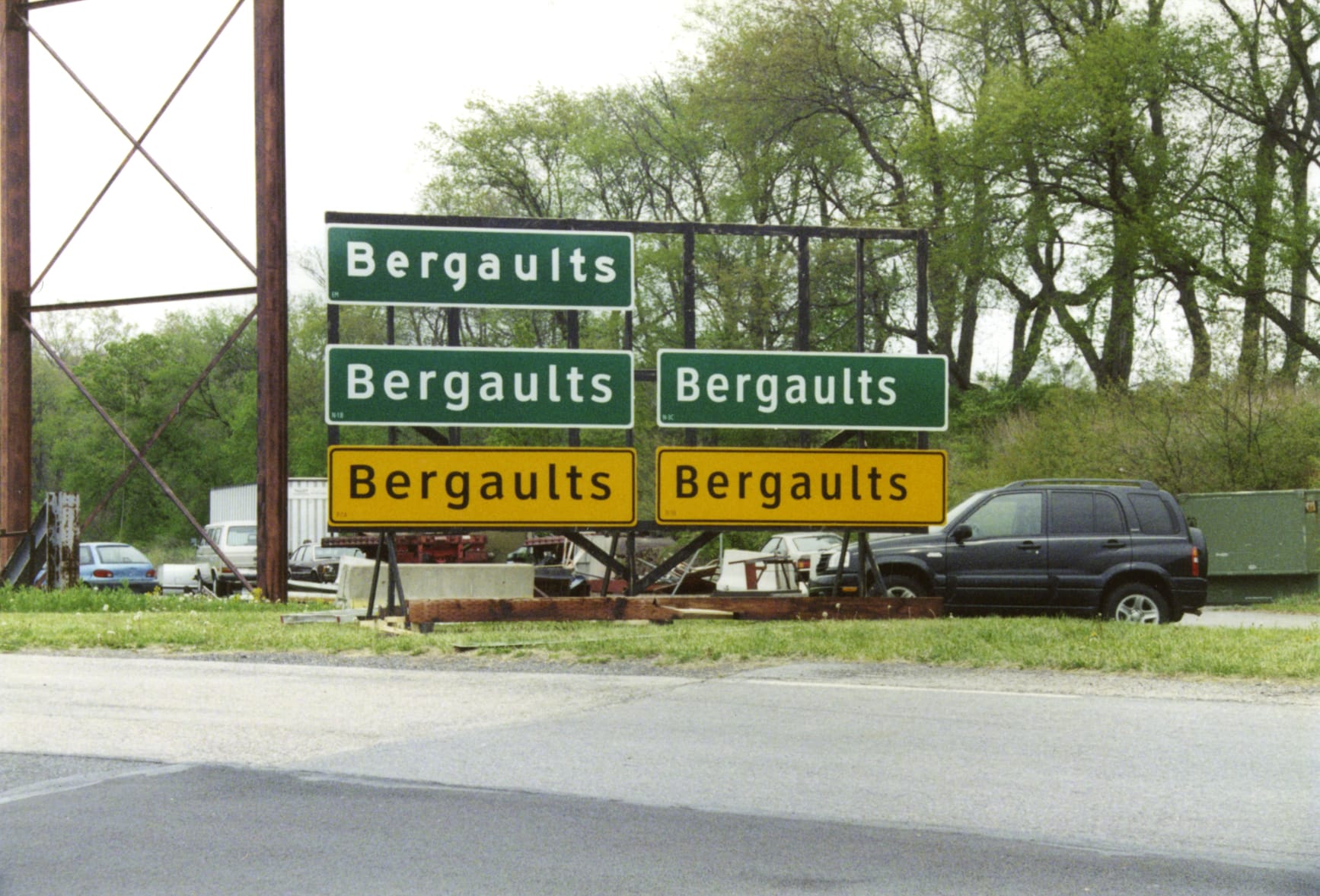
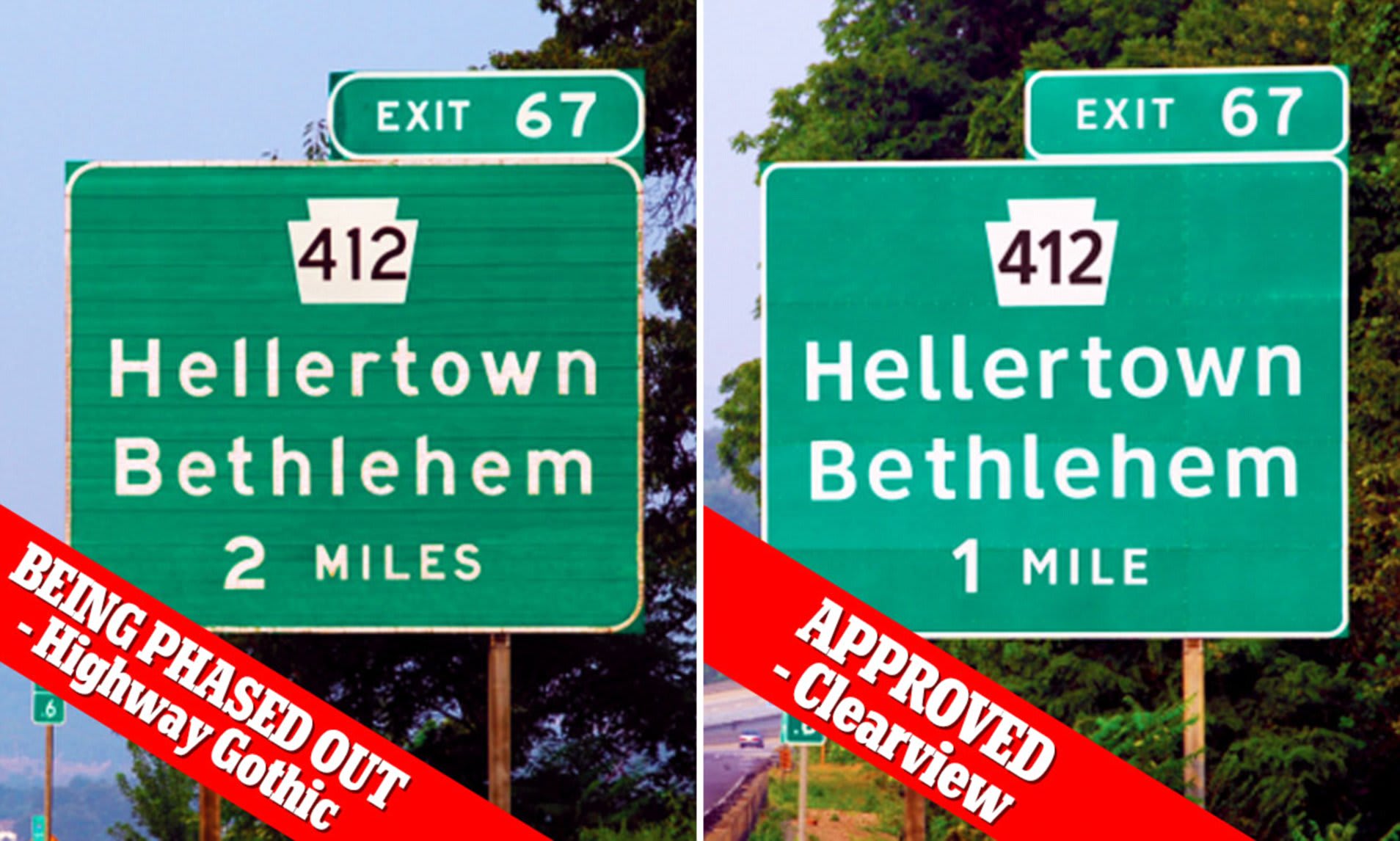
The Highway Gothic vs. Clearview Typeface*
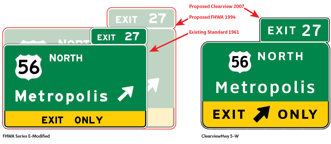
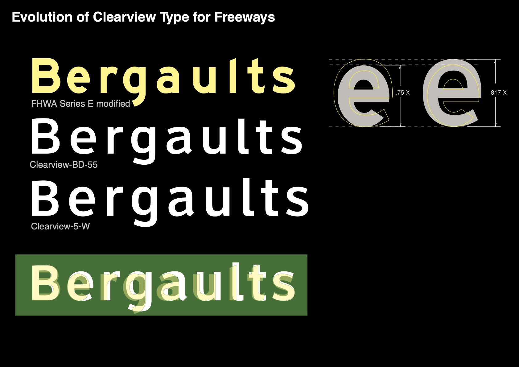
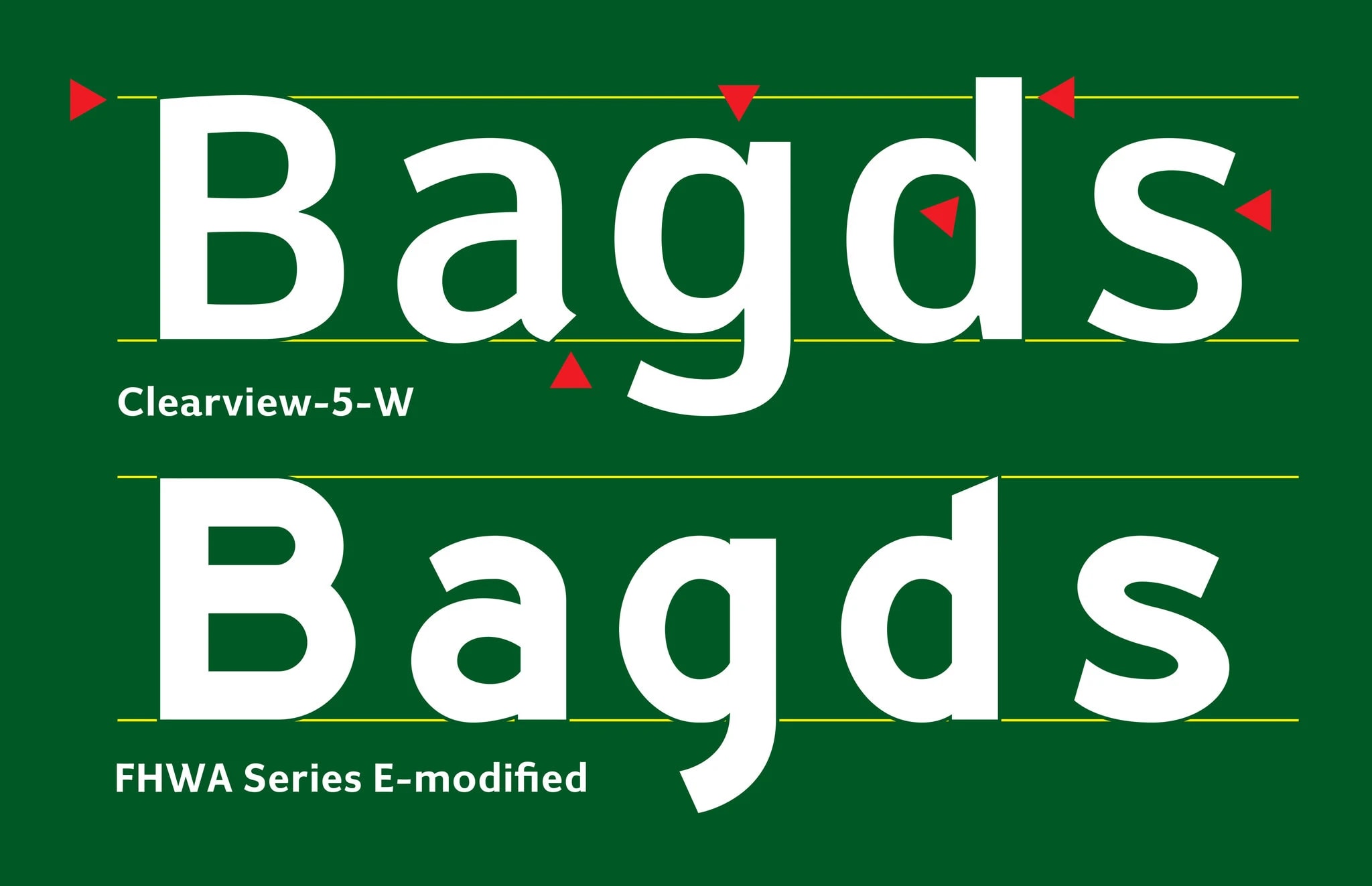
With sign legibility and driver safety in mind, the Federal Highway Administration (FHWA) approved the use of a new typeface known as “Clearview”, agreeing that it was easier to read from a distance than its predecessor, Highway Gothic. Highway Gothic’s problems rested in the interstices (spaces) of its “a”, “e” and “u”, and when reading them at higher speed, these vowels would present more like an “o”. In addition, lower case letters like “i” and “l” were indistinguishable, with halation further heightened by the glare of headlights at night.
Enter graphic design and wayfinding activist, Donald Meeker. While working for the Army Corps of Engineers creating signage for rivers and waterways, Meeker set out to understand why 200 people a year died of drowning accidents during the 30-40 minutes before dusk and dawn. Concluding that sign visibility was especially poor during those short minutes, he relied on his design expertise to improve safety and function, eventually creating a uniform yellow fluorescent signage system that was legible during dusk and dawn.
Equipped with life experience and funding from 3M, the Minnesota-based manufacturer whose products include Post-it notes and scotch tape, Donald Meeker, Chris O’Hara, Harriet Spear and type designer, James Montalbano, developed a way to open up the spaces between the strokes of Highway Gothic’s lower-case letters, giving birth to the Clearview font alternative.
Meeker and his design team tested Clearview’s glance readability and uniformity with the Pennsylvania Transportation Institute (PTI) at Penn State University. PTI studies found that compared to Highway Gothic, Clearview improved reading distance by 16% which could easily translate into 80 extra feet of reading distance or an extra 1.2 seconds of reading time for drivers travelling at 45 miles per hour. This finding was buoyed by a Texas Transportation Institute at Texas A & M University study, which confirmed the importance of giving drivers with sight disability significantly more time to react to information displayed on the road.
Why Design Matters
aka “We Don’t Know What You Did, But the Signs Sure Are Easier to Read”
The FHWA’s support and Interim Approval memo on September 4, 2004 paved the way for design activism - the concept of using form to advance function. In his New York Times opinion piece, author of “The Road Taken: The History and Future of America’s Infrastructure”, Professor Henry Petroski writes the following: “As with any problem in design, the first step toward solving it is to understand how and why existing approaches fail.”
In developing a solution, Meeker retooled Highway Gothic’s lower-case letters, positive and negative color contrasts and made them more readable to America’s growing population of sight-challenged drivers. This modification may not mean much to a typical motorist or person who could care less about design, but that is part of the point: to convey information clearly, without distraction and to help readers gain confidence in new surroundings whether they are driving on an unfamiliar road or reading a PowerPoint deck with fonts and color that don’t match.
Vincent Van Gogh, who said, “If only I had known the laws of color in my youth”, was not alone in helping people open up capacity for visual literacy. Neither was Donald Meeker.
Meeker’s work was heralded as a civic, social and design success. And soon after the FHWA’s memo, over 30 states switched allegiances from Highway Gothic, making Clearview the dominant choice for road signage.
In addition, Clearview became the first digital font ever acquired by Cooper-Hewitt for the Smithsonian Design Museum, and it was hailed as one of ten typefaces of the decade in 2010 by Print magazine.
But something strange happened on the way to 2020. On January 25, 2016, the FHWA rescinded its 2004 decision, announcing that it will deauthorize the use of Clearview as a typeface for signage. The edict applied to 50,000 miles of freeway and four million miles of road throughout the United States.
In a Wired magazine article, "America's Highway Fonts Got More Drama Than The Bachelor", Donald Meeker describes the FHWA’s deauthorization as “a little bizarre”. He continues, “Anybody that uses (Clearview) and uses it extensively knows that it is working well.
But herein lies a mystery. In its Federal Register notice, the FHWA concluded that although Clearview worked well for white lettering on a dark background, it was ineffective on dark lettering on white background. Moreover, it determined that the “retroreflective” material used on freeway signs created more of a problem than did the font of choice when it came to nighttime readability. Finding no benefit that could be remedied by simply replacing older Highway Gothic font signage, the FHWA reversed course.
Font Supremacy:
The Federal Highway Administration Does an About Face
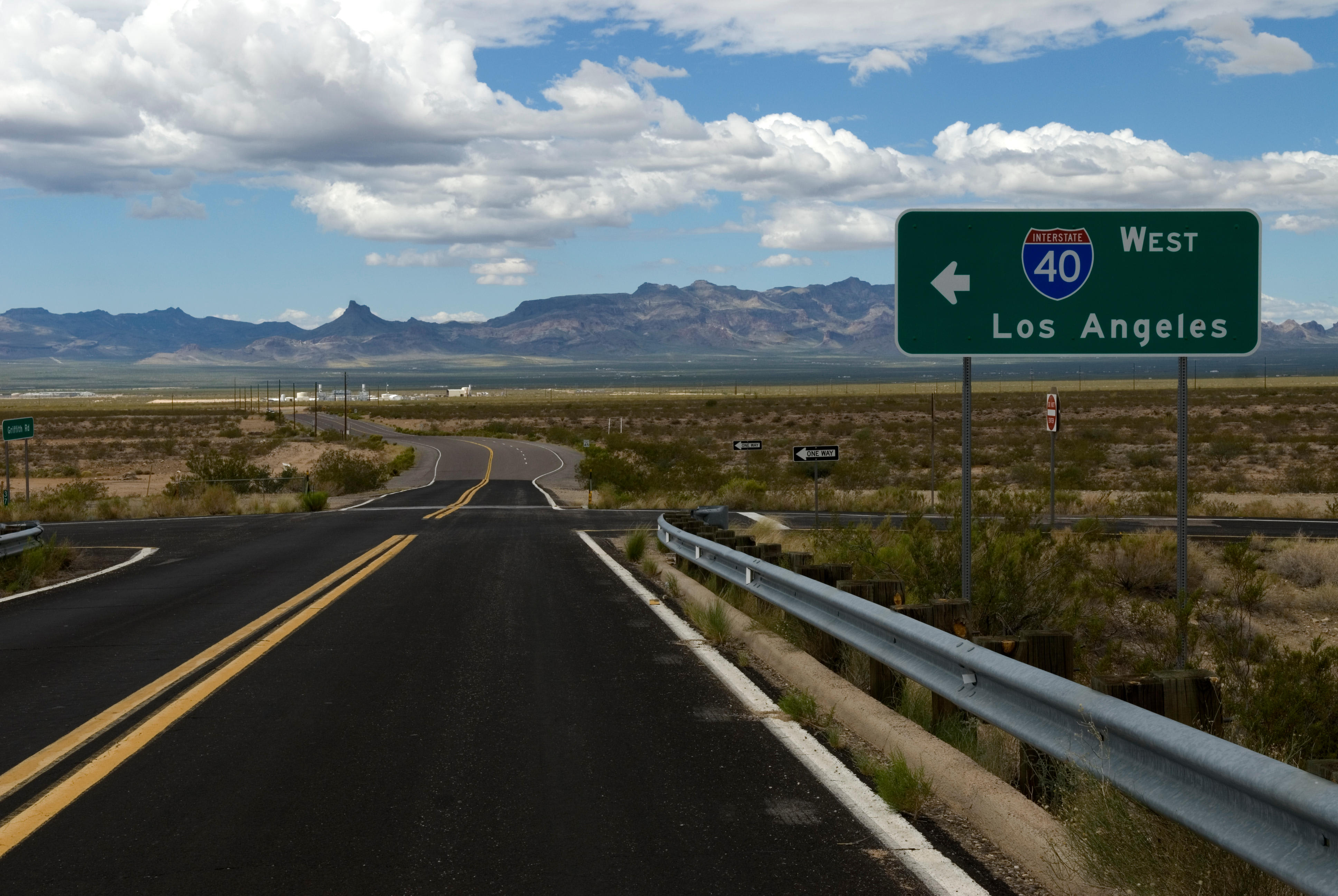
In an about face comparable to an episode on the Bachelor, Highway Gothic, at the end of the day, proved to be a tough font to dethrone. Typographer and inventor of the Interstate font, Tobias Frere-Jones describes it as a very “American, brash and blunt, not so concerned with detail” typeface. Its legion of fans includes Richard Moeur, a vintage road enthusiast who views Highway Gothic as a symbol of connectivity to America’s wild and open road. In an ode to the font, Moeur exclaims, “There it is, in big 16-inch letters, and a 3-foot Interstate shield, on a 10x16 foot sign – I-40 WEST Los Angeles!”
Let us pray that we blunt and brash, maskless and free from Covid motorists make it to halation and back. Let us pray that we make it west to Los Angeles, unblinded by halos of light. And let us pray that we are safe and on time.
*The main difference between a font and a typeface is that a font is part of a typeface. Highway Gothic, for example is a sans-serif typeface with a common design ethos. However, it is made up of a whole collection of fonts, each in a specific weight, style and size, i.e. Highway Gothic Regular Bold or Italic, Highway Gothic 9 point or 10 point.
(*2) Coincidentally, 1.2 seconds is approximately the same amount of time it takes to read an incoming text while driving, making texting and driving highly risky, regardless of one’s age.
About The Authors

Ami Pascual Spear is a writer who loves driving her British green MINI Cooper throughout LA. She studied City and Regional Planning with an emphasis on urban design and economic development.
Together with
Sydney Mallari
Guest Contributor